Now I enjoy watching the NBA, especially the San Antonio Spurs. That's my team and beside my point. The thing about the NBA players is they're babies. Spoiled babies claiming this "NBA CARES" bullshit. I see the stupid look on Kobe's face as they continue to announce more delayed games. If your ass wasn't so fucking greedy you'd be playing with the balls that you love so much. Now this whole NBA cares bullshit is out of the bottle. You pussies wouldn't be out there if you weren't getting a paycheck. You NBA pussies can take your greed, take your fouls, and your NBA Cares bullshit, roll it all up into a ball, turn it sideways and stick it straight up your candy asses. Just like your greedy asses I wouldn't give a bucket of piss for your future.

Monday, October 24, 2011
So Much For The NBA Cares
The greed of pamperd athletes. I promise to be brief...
 I was just watching the local news a few minutes ago. Lots of interesting stuff going on these days. But Arizona Cardinals getting their asses handed to them is nothing new. But the thing that pissed me off the most was the NBA.
Now I enjoy watching the NBA, especially the San Antonio Spurs. That's my team and beside my point. The thing about the NBA players is they're babies. Spoiled babies claiming this "NBA CARES" bullshit. I see the stupid look on Kobe's face as they continue to announce more delayed games. If your ass wasn't so fucking greedy you'd be playing with the balls that you love so much. Now this whole NBA cares bullshit is out of the bottle. You pussies wouldn't be out there if you weren't getting a paycheck. You NBA pussies can take your greed, take your fouls, and your NBA Cares bullshit, roll it all up into a ball, turn it sideways and stick it straight up your candy asses. Just like your greedy asses I wouldn't give a bucket of piss for your future.
Now I enjoy watching the NBA, especially the San Antonio Spurs. That's my team and beside my point. The thing about the NBA players is they're babies. Spoiled babies claiming this "NBA CARES" bullshit. I see the stupid look on Kobe's face as they continue to announce more delayed games. If your ass wasn't so fucking greedy you'd be playing with the balls that you love so much. Now this whole NBA cares bullshit is out of the bottle. You pussies wouldn't be out there if you weren't getting a paycheck. You NBA pussies can take your greed, take your fouls, and your NBA Cares bullshit, roll it all up into a ball, turn it sideways and stick it straight up your candy asses. Just like your greedy asses I wouldn't give a bucket of piss for your future.
Sunday, October 23, 2011
Google+
A slow weekend, time to write
I really like Google+. The user engagement here is near instantaneous sometimes and the discussions are quite good (all trolling aside). It's unlike any social network I've used, but since my last long post, I've been pondering something.
Why can't Google+ replace my blog?
Technically, as it stands right now, it actually could. I don't write there very often, and when I do, not a lot of people visit. So I began asking myself, why can't Google+ just up and replace mine(or anyone else's) blog?
Style
Already I've been able to bold words, italicize them, and I can even strikethrough them if I so desire. The ability to add some kind of stylized formatting to a post is awesome, but there's a lot left to be desired.
Headers, colors, fonts, and sizes all can play into the reading experience. We've got the most elementary of tools at hand to try and organize text as we'd like,and while it works, it's not perfect.
Formatting
Similar to style, the ability to format a post is incredibly important. Yes, I can attach media to this (multiple pictures, URLs, videos, etc.), but because I can't put them where I want them to be, they're kind of like an afterthought in the grand scheme of the work.
Take something I've been working on the detailsfor for, a post titled Tater tots vs. french fries: An objective analysis. Because this is a media-heavy post, pictures really need to be where I want them for the text to not only flow and make sense, but be enhanced by the visual. Google+ doesn't let this happen.
Brand (or, ego)
While you could make the argument that your name (or identity, natch) is the best brand you have, I'd still like to have a personal brand that exists off of a social network, and I assume others do, too.
By limiting posts to here, your brand might never get kicked off the way you'd want.
It's not all doom and gloom, though...
Something powerful Google+ has is the lack of a barrier to entry. It's instant, immediate, and in real-time.You don't have to go anywhere else to read what's up.
I'd assume had I written that post up on my blog, pasted the link, and shared it, engagement would have been lower. Externals link, yuck. You mean I have to go someplace to read this? And comment on it?
So Google+ presents an interesting dilemma. Does it stand a chance to become the next blogging platform? Probably not, not with Google having Blogger and stuff.
But can it serve as a gateway for someone to increase their engaged audience, then say, ween them off of the teat of Google+ once you've proven you truly have something to say? Maybe.
When Google+ first came out, the Android Central writers had an impromptu Hangout/podcast, talking about Google+. Thet said in six months (right around the start of the new year), they'd have another one, to talk about if Google+ flourished or floundered, how it'd changed, and if it was here to stay.
Thinking about the future of Google+ and all it can be used for really gets me excited. The fact I can say all this to y'all, right here, makes me excited, too.

Wednesday, October 12, 2011
Swamp Thing #2 Review

Will Alec Holland accept his destiny?
I loved the first issue of Scott Snyder and Yanick Paquette's Swamp Thing. In fact, I reviewed the book a month ago and lavished it with praise, top to bottom. That's why it's kind of shocking, even to me, that I loved Swamp Thing #2 even more. Scott Snyder has somehow managed to make this series not only a continuation of everything that has come before in Swamp Thing, but also a completely accessible origin story for Alec Holland's tenure protecting The Green. Swamp Thing #2 is the issue that lays it all out, defining the legacy of the character and establishing the foundation for an epic struggle to preserve The Green against its darkest hour with Holland trapped in the middle.
Swamp Thing #2 picks up directly where issue #1 ended -- Swamp Thing has come to meet Alec Holland and explain why he is so important to The Green's cause. The vast majority of Swamp Thing #2 features Swampy giving a cliff notes-style history lesson about his life, the importance of The Green, the role of the Parliament of Trees and the imminent threat that is currently trying to track down and kill Holland.
I'll be honest, I was a little skeptical about how Snyder would pull together everything that came before with the character and still manage to create a book that felt easily accessible for new readers -- one of the major selling points of the New 52. Swamp Thing #2 proves he knows what he's doing. What we have here is a completely fresh origin story for Alec Holland's journey into the role of Swamp Thing which respects everything previously established from writers such as Wein, Moore, etc. Snyder has discovered a loophole in the Swamp Thing legacy for him to firmly plant his narrative roots.
One of this series' biggest selling points is, without a doubt, Yanick Paquette's incredible artwork. His pencils once again shines with Swamp Thing #2. Not only are panels incredibly detailed with lifelike figures, but his layouts once again blow the mind. It's the small touches like panels broken up by branches and blood streaks that really make this the complete artistic package. The only criticism I have against the art of Swamp Thing #2, and it's a minor one, is that some double-page spreads are so elaborate that it becomes hard to figure out which word balloon should come next.
In this writer's humble opinion, Swamp Thing #2 is the book of the week. Snyder has set the groundwork for one epic story. It also doesn't hurt that he has an artist like Yanick Paquette to draw all his beautifully creepy imagery, of which this issue is full of. Swamp Thing is a series that you need to be reading, no questions asked. And if you aren't yet, hightail it to your local comic shop and buy into this.
Penguin: Pain and Prejudice #1 Review

Get familiar with the upbringing of Oswald Copplepot.
One thing is for certain: Oswald Cobblepot had one hell of a troubled upbringing. Not only did his dear old dad drop him on his head seconds after he was born, but he was also forced to watch his parents get intimate as an infant and was constantly picked on in school growing up. Writer Gregg Hurwitz takes every available opportunity he gets to throw Cobblepot under the bus throughout the various flashbacks in this issue to help explain how he becomes the man we know him to be in Gotham, as well explain as why he takes on "the Penguin" moniker. Essentially, Hurwitz writes the Penguin as a cranky old Gus that rotted from the core because no one was around to give the man a hug growing up. For the record: it works.
We've always known Penguin to be the type of businessman that will scorch the earth if he doesn't get what he wants. Hurwitz may get this across better than most writers who have tackled Penguin before him. The majority of Penguin: Pride and Prejudice #1 is spent with Penguin getting everything he desires with simple nods and snaps of the fingers. He's a bully that no one messes with, and God help you if you do. Not only does Hurwitz's approach to writing the character work well to establish him as one of the most feared men in Gotham, but it also makes the cliffhanger of this book more impactful when Penguin meets the real owner of Gotham City. There's definitely one man that the Penguin can't bully around. I bet you can guess who that is.
Szymon Kudranski's artwork might be this issue's best aspect, however. Kudranski's reliance on establishing atmosphere through shadowplay perfectly complements a series of this nature. With the help of colorist John Kalisz, Kudranski's pencils are perfectly moody and travel down some dark paths in lockstep with the issue's script.
I'll be honest, I wasn't expecting much from Penguin: Pain and Prejudice #1. But the book thoroughly surprised me. The rest of Batman's rogues could benefit from similar mini-series to establish their place in the world of Gotham for new readers. Gregg Hurwitz and Szymon Kudranski have a solid handle on the Penguin character and I'm excited to see where this leads. Most of all, I want to know what the deal is with the Penguin's Norman Bates-esque relationship with his mother. It's creepy, to say the least.
Tuesday, September 13, 2011
Metal Gear Solid HD Collection Comes to Vita
Japan's getting Metal Gear Solid 2 and 3 on Sony's handheld.
The Metal Gear Solid HD Collection is coming to a PS3 near you soon, but it's also coming to the PlayStation Vita in 2012. Metal Gear Mastermind Hideo Kojima took the stage at Sony's Tokyo Game Show conference and let the world know that the collection will be coming to the Vita in Japan and making use of cloud saves. Will it come to the U.S. and other territories? Time will tell –especially as the U.S. HD collection packs Metal Gear Solid: Peace Walker and the Japanese version doesn't.

Sony Reveals Vita's Release Date
December it is!
At today's Sony press conference at Tokyo Game Show, Sony finally revealed the release date for the PlayStation Vita, the follow-up to Sony's PlayStation Portable.
Japanese gamers will start playing on December 17th. There's no word yet on North American or European release dates, though we'll update with any news as we hear it.

Friday, September 9, 2011
Sprint Looking To Keep It's iPhone Plan Unlimited
Sprint rumored to retain unlimited data with iPhone 5 launch, prove unicorns are indeed legit.
Here's the word straight from unnamed sources: Sprint's not only getting the elusive iPhone 5 -- it's keeping an unlimited data plan around just to sway buyers who may otherwise spring for the AT&T / Verizon Wireless variants. Furthermore, these folks in-the-know have good reason to believe that it'll be launched "next month," which gives Apple a shockingly small amount of time to invite us over for a west coast reveal. As it stands, the only folks who'll get limitless data with an iPhone 5 on its existing US carriers are those with grandfathered plans; any new customers on Ma Bell or Big Red will be forced to select one of many tiered options. Not surprisingly, neither Sprint nor Apple are commenting on the story, but if it all proves true, Sprint can definitely hang its hat on having one serious competitive advantage.

Thursday, September 8, 2011
Holland Runs From His Legacy
Swamp Thing #1 Review
Okay, I get it now. Scott Snyder isn't a real person. He's some super intelligent, sentient computer where you put in a concept, a few variables and out pops a brilliant story. This is the only explanation that I can muster to wrap my head around his recent, flawless track record. And if that wasn't clear enough for you, I'll state it bluntly: Swamp Thing #1 is fantastic.
I'll be honest with you, my history with Swamp Thing doesn't run as deep as I wish it did. I've read bits and pieces of Alan Moore's seminal run, but that's about it. I know of the character, his origin and some of the trials and tribulations he's been through. Roll credits. That's why I was really excited to crack into Scott Snyder and Yanick Paquette's Swamp Thing #1. I wanted to see if it truly felt like an entry point for new readers. Cheerfully, I can report it does.
If you consider yourself a fan of Scott Snyder's writing, then you're probably aware of how he loves to frame his stories through metaphor-heavy narration to give added context to situations. Snyder uses the same approach right from the get-go with Swamp Thing #1, penning a beautiful monologue from the point of view of Alec Holland as he remembers back on his younger days helping out at his father's flower shop. This fantastic monologue is then juxtaposed with haunting images of creatures such as birds, bats and fish dropping dead. It's a fantastic way to start this series that sets a dark tone that never quite dissipates. But then again, this is a Scott Snyder comic, did you expect sunshine and rainbows?
Swamp Thing #1 also presents an intriguing mystery to grab the attention of readers. Alec Holland having the ability to remember the memories of Swamp Thing is a nice spin that should provide plenty of twists and turns for this series down the road. Snyder peppers in just enough in this first issue to have us eating out of his hand.
As much as I loved the story of Swamp Thing #1, I think the real star here is the artwork of Yanick Paquette. I mean, holy crap. Paquette proved himself a great artist with his work on Batman, Inc., but he's taken it to a new level with Swamp Thing. He was born to drawn animals dying and plants uprising. And I mean that in the best, most flattering way possible. Paquette also goes above and beyond with page layouts here in Swamp Thing #1. Nearly every page in this book is worthy of being turned into a poster. For my dollar, Paquette has drawn the most visually pleasing book of the New 52 thus far.
So, Swamp Thing #1 is a book full of win. Just buy it, you won't regret it one bit. Scott Snyder and Yanick Paquette have delivered a fantastically written, beautifully drawn opening chapter to usher in Swamp Thing's return to the brave, new DCU. Who's pumped to see where this goes from here? This guy.

Your re-introduction to the Man of Steel.
Action Comics #1 (2011) Review
I've received a lot of feedback regarding my review of Justice League #1,in which I said that the book was fun, if not a balls-to-the-wall explosion of mind-bending proportions -- an expectation that is, in my opinion, unrealistic and perhaps misplaced. The same could be said of Action Comics #1,in which writer Grant Morrison takes his time to introduce (quite economically, I might add) all the main players of the series and establish their relationship to Superman. As far as issue #1 goes, everyone is where we'd expect them to be. Well, for the most part.
Lois and Jimmy are co-workers, Lex Luthor is plotting with General Lane to take down the strange visitor from another planet and Clark Kent is a do-gooder that is nice to his landlady and separates his colors from his whites when he does laundry. Of the entire cast, the only character that truly feels different is Superman himself. Costume aside, this is a Kal-El that is in the early days of career. It's established in Action #1 that Superman is still leaping (and only leaping) tall buildings and that his powers are still growing. Morrison presents him as a cocky, self-assured vigilante, a far cry from the messianistic icon that we know (or I guess, assume) he'll become.
I forsee some Superman purists taking issue with Morrison's take on the younger Kal-El, but as with any of his work, I urge those of you that feel this way to stick with it. As this is an early take on Superman (you can see the current day Supes in Swamp Thing #1 this week), Morrison is clearly setting up a period of growth for the character. More interesting than seeing how Kal-El grows as Superman is how his relations with other characters develop. In Action #1, Clark is working at the Daily Star, the Daily Planet's #1 rival. He's got journalistic integrity and comradery with Jimmy and Lois, but they're only six months into their friendship. Morrison has put the pieces in play for a very different spin on the trio' s relationship.
While the book is chock full of great action (fittingly), my one concern with it is the actual lack of Superman's perspective. Aside from one stellar scene with Clark Kent, the scenes with Superman are prodominately shown from an outsider's perspective, offering no real insight into the character other than his nature as an overwhelming alien force of extreme strength. We understand that he's there to help, but that comes more from our previous knowledge of the character than what we see in the book.
However, it's incredibly refreshing to have a Superman that is active and takes control of the situation he's in. Morrison's Superman is hands-on, but fallible. Action #1 establishes more than once that Superman isn't an all powerful god-like being. Other than being unable to truly fly, Morrison concocts a great scene in which Supes is stopping a speeding train. Upon impact, Superman mutters "ow" ever-so-softly. It's a great moment that, coupled with the glimpse of brilliance we catch from Lex Luthor in this issue, suggests an equal pairing between heroism and villainy for these soon-to-be arch rivals.
The art of Rags Morales captures the action well. The many high-octane action sequences scattered throughout the book shine with Morales' blocking and storytelling. While finer details aren't always the main attraction of his panels, the action sequences in this debut issue are effective because of Morales' ability to adequately pace the scenes. However, the other half of the book -- the talking head dialog scenes -- are less exhilirating. Morales' facial anatomy varies wildly between scenes, depending on angle and facial expression. It's not distracting, necessarily, but the slower nature of these scenes in comparison to the action sequences -- both in writing and art --gives Action #1 a jarring pace.
When all is said and done, this is the first chapter of a very long story (Morrison told us he's got 16 issues plotted out), and it reads as such. Much like Morrison's work previous,the whole will likely be greater than its parts. However, that doesn't mean Action Comics #1 is unenjoyable, not by any means. Morrison presents many interesting ideas in issue #1 that will most certainly blossom in ways we've never even considered.

Red Skull: Incarnate
Chapter 3 Review
s another depressing installment in this series that details the rise of Johann Schmidt from orphaned boy to power-hungry Nazi. Thus far, Greg Pak has done a solid job making Schmidt's transformation feel nature and not heavy-handed or overly melodramatic. However, issue #3 does resort to more exposition than I care to see to move Johann into the next phase of his troubled upbringing. This doesn't make Red Skull: Incarnate #3 a bad issue mind you, but it definitely dampens the dramatic impact of the last page reveal.
In issue #3, Johann runs into one of his old friends from the orphanage, Dieter. Greg Pak uses Dieter as a measuring mechanism to show how much Johann has changed since he ran away from his past life. Johann is now a man of action, who has also misplaced his moral compass due to the harsh living conditions he's been put through. His interactions with Dieter in this issue are proof of that, and this subplot's outcome winds up being quite tragic, as expected.
However, the final few pages of Red Skull: Incarnate #3 dive into exposition-heavy narration to drive the ship home. While I'm all for getting a history lesson out of an engaging comic, this particular example kind of kills the pacing of this issue dead. Greg Pak might have felt this approach necessary to sell the last page reveal, but a part of me believes Pak could have come up with something a little more creative to drive his point home.
Red Skull: Incarnate #3 might be the weakest link of this series thus far, but it's still a good comic. Outside Pak's exposition-heavy closing, the characterization remains strong and the art by Mirko Colak is still top notch.

Friday, September 2, 2011
And So Begins The New DC Universe
Justice League #1 Review
It's finally here. It's out with the old and in with the new. Flashpoint wrapped up what was left of the old DC Universe and right alongside it came Geoff Johns and Jim Lee's Justice League #1. The book has been set apart from the rest of the New 52, heralded as the movement's flagship title. This is the comic that longtime readers will be picking up to make their judgment calls, but more importantly, it's the title that new readers will be turning to in the aftermath of the media storm that is taking place as you read this. But underneath it all, beyond the hyperbole generating hype machine, is this a comic that will satisfy both crowds?
Justice League #1 brings us five years into the past of the new DCU, a time when superheroes were feared by the public and operated separately from one another. They don't know one another's identities and they certainly don't trust each other. Johns and Lee are clearly aiming to establish the coming together of the Justice League we all know and love, but issue #1 would be more accurately labeled as a Batman/Green Lantern team-up. Johns delivers the goods on the personality clash of Hal Jordan and Bruce Wayne, with a bulk of this issue featuring fun banter that conceals essential exposition to get new readers up to speed on the general concept behind each character. To be honest, reading it as a longtime fan requires some getting used to, as it's a scene so familiar yet ultimately brand new. If you look at it from that perspective, it should put to rest any lingering fears that these characters might not be the same ones you knew and loved as they were a week ago. You'll get that familiar feeling, but without the expectation that you'll be able to predict where the story goes next.
The one real detriment of the book is that it suffers from an extremely slow pace. There's plenty of action to be had, but the centerpiece of this issue is Batman and Green Lantern taking jabs at one another while on a hunt to find the alien in Metropolis known as Superman. It's not dull, but if future installments keep this pace, it could become problematic once the amusement of seeing these characters interacting for the first time wears off. To his credit, Johns recognized this in issue #1 and switched gears just as I grew tired of the back-and-forth between Hal and Bruce. Issue #1 briefly touches upon Cyborg –un-cyborged at this point –and introduces another Leaguer by issue's end that will hopefully kick things into a higher gear come issue #2.
If you're a new reader, curious whether DC is holding their promise of accessibility, worry not. Justice League #1 is entirely competent as an introduction to the DCU, albeit a very small step towards a landscape that will only continue to reveal itself as the New 52 press on.
Jim Lee's return to a monthly book is always exciting, and Justice League #1 looks exactly how you'd expect it to. Lee's layouts give the book a larger visual scope than is implied in the narrative; he often works in widescreen or tall vertical panels, giving the book a cinematic tinge that parallels the theoretical magnitude of what this series represents. His character work is solid and the costume designs look superb "in action," though there are still the common instances of facial identities bleeding together and a limited range of emotion. However, Johns gives Lee plenty of constructs and action sequences to let loose on, and despite the slower pace of the book, the artist gets a chance to concoct some truly awesome stuff (fire truck construct,anyone?). Equally great is the amount of attention that Lee pays to his backgrounds, offering a consistent portrayal of Gotham's rooftops and skyline.
Justice League #1 is fun, no doubt about it. There is a certain sense of feeling underwhelmed after reading it, simply because it's been hammered into our brains that this book represents the ushering of the single biggest comic book industry initiative in years. It's gained a whole lot of external weight. But when you strip all that excess media hype away, you're left with a perfectly entertaining –if somewhat safe –glimpse into a universe we're only just beginning to understand.

Tuesday, August 30, 2011
The DC Universe Takes Flight, Again
When the latest issue of Justice League is released on Wednesday by DC Comics, it will be scrutinized like no other installment in the 76-year history of that publisher of superhero adventures.
Some readers may be drawn in by its cover depicting revised incarnations of Superman and Batman, or a story line that tells of a tense first meeting between these costumed characters before they became allies.
But DC is betting that more potential customers will be attracted by an insignia that boldly declares this to be issue No. 1 of Justice League; never mind the hundreds of chapters that came before it.
Starting on Wednesday, the publisher is resetting all 52 of its continuing series, including venerable titles like Action Comics and Detective Comics that introduced Superman and Batman in the 1930s,at issue No. 1, and using the opportunity to revise or jettison decades of continuity in the heroes' fictional lives.
Within the DC universe, this new status quo is the result of efforts by the fleet-footed Flash to alter the course of history. But in the real world it is a last-ditch plan to counteract years of declining sales throughout the comics business.
The success or failure of this plan will have far-reaching implications: it could alienate longtime fans for the sake of new readers. And it could portend a more widespread exhaustion with film and television projects that are adapted from comic books and that are constantly starting over from scratch.
In an entertainment industry that is perpetually looking to breathe new life into old properties, and that has planned several years of movies and multimedia projects about back-to-basics superheroes, this revisionist strategy could determine "whether or not DC Comics, as a comic-book publishing company, will continue in the future," said Rich Johnston, a blogger who covers the comics business for the Web site Bleeding Cool. "There's an awful lot at stake here, and that's why they've thrown everything and the kitchen sink at this."
DC, which is owned by Time Warner, has long lagged behind its rival Marvel Comics, the Disney-owned publisher of Spider-Man and Captain America, in market share if not audience enthusiasm. Its latest company-wide overhaul has been almost a year in the making, devised in October at an editorial retreat where staff members were trying to create a love triangle for Superman, who wed Lois Lane in 1996.
Once the team decided it did not have to be bound by this marital detail, "we started talking about a lot of crazy, what-if situations, and out of that openness came the idea of renumbering the entire line," said Jim Lee, co-publisher of DC Comics and an illustrator of the new Justice League series.
The publisher says its streamlined storytelling efforts are aimed at its existing readership as well as at new or lapsed comics buyers, but acknowledged that an issue labeled "No. 1" was particularly inviting to first-timers.
"I certainly wouldn't buy a DVD series of a hit show and start at Season 7," Mr. Lee said. "I would want to go back and start from the beginning."
The process of restarting a long-running narrative at Page 1 - known in industry parlance, and with growing derision, as a reboot - is nothing new to comics: in the 1980s DC dismantled its narrative architecture in the venerated mini-series "Crisis on Infinite Earths," and has sought to recapture its anything-could-happen spirit in story lines with titles like "Infinite Crisis" and "Final Crisis." DC and Marvel have been revising their World War II-era characters since at least the 1950s,and Marvel has an entire publishing line, Ultimate Comics, that features contemporary takes on its traditional heroes (like a Spider-Man who is of black and Hispanic descent).
In Hollywood the reboot impulse has yielded hit films like "Batman Begins" (and its billion-dollar-grossing sequel, "The Dark Knight") and noncomics properties like this summer's "Rise of the Planet of the Apes."
The DC reboot arrives at a crucial moment for the comics business, which, like the publishing industry as a whole, is experiencing continued erosion in sales.
Recent reports by ICv2, a research company that tracks pop-cultural products, said that in July dollar sales of periodical comics were down 4.27 percent from the same month last year, down 4.6 percent in June and down 6.3 percent for the second quarter over all. Sales of graphic novels at traditional bookstores were up, though this was partly because of the liquidation of the Borders bookstore chain.
The success of superhero movies like "Thor" and "Captain America: The First Avenger" did not entirely rub off on the comics that inspired them, with individual titles struggling to sell more than 100,000 copies at $2.99 or $3.99 a copy. One possible bright spot: DC says preorders for Justice League No. 1 have exceeded 200,000 copies.
Meanwhile, the increasing number of entertainment franchises that apply a back-to-basics approach to comics characters is suggesting a paucity of original ideas. Next summer Sony Pictures Entertainment will release "The Amazing Spider-Man," a 3-D retelling of the origin story seen in the 2002 hit "Spider-Man." Warner Brothers has a new Superman movie, "Man of Steel," coming in 2013, following an unsuccessful reboot, "Superman Returns," in 2006, and is contemplating a new Batman series to follow the 2012 sequel, "The Dark Knight Rises."
"That whole attitude of, 'Oh, go ahead, start over, reboot,' people get tired of that and it worries me," said Jim Shooter, a former editor in chief of Marvel Comics who now holds that title at the comics publisher Illustrated Media. "As storytellers, I don't know where we wandered off to."
Henry Jenkins, the provost's professor of communication, journalism and cinematic arts at the University of Southern California, said the idea of returning classic heroes to their origins long predated comic books.
"Part of the nature of culture is that we retell stories that are meaningful to us, again and again, in different ways," Mr. Jenkins said, pointing to Homer's "Iliad," Virgil's "Aeneid" and Dante's "Inferno" as "continual reboots of Greek mythology."
But Mr. Jenkins said that he - like other fans -has come to question the motives behind many of the pop-culture reboots. "We can see revamps that have no clear purpose, endless numbers of '80s TV shows being brought to the screen with no innovation to speak of," he said. "Or we can talk about revamps that actually go someplace," like the recent revival of "Battlestar Galactica," which "is much deeper than the original 'Battlestar Galactica.' "
DC Comics executives were nonetheless enthusiastic about their chances for success and said there was no undo button for the changes about to be put in place.
"We're not looking for a way of going back to what we did before," said the DC editor in chief Bob Harras,who was Marvel's top editor in the mid-1990s. "We like to say here, 'No trap doors.' This is what we're doing."
But others are contemplating the possible outcomes if DC's latest clearing of the table does not increase sales over the long run.
Laura Hudson, the editor in chief of the Web site Comics Alliance, said the business was eventually headed for a reckoning in which "this very specific ritual of going to the comic-book shop once a week to get your new 22-page comic" becomes obsolete.
"It's hard to see it persisting into the future in exactly the way it's existed before," Ms. Hudson said. "It's going to stop as soon as it stops becoming profitable."
Though DC seems to be laying the groundwork for such a transition by selling digital versions of its new comics on applications for tablet devices, Mr. Harras said he hoped to see the traditional sales model endure. "I love print, I love going to the comics shop, I've done it for more years than we can count," he said.
One colleague who does not seem to share Mr. Harras's optimism is the prolific comics writer Grant Morrison, who in a recent interview with Rolling Stone said there was "a real feeling of things just going off the rails" in his industry, and that the superhero narrative had perhaps outgrown the printed page and "found a better medium through which to replicate" in movies or video games.
Among the various assignments currently on Mr. Morrison's plate, he is the writer of DC's newly rebooted Action Comics.

Tuesday, August 23, 2011
This Is What Happens When You Steal Another Man's Girl, Steve.
Captain America #2 Review
Lay your worries to rest, Ed Brubaker and Steve McNiven don't let us down with Captain America #2. But honestly, did you really expect them to? Captain America #2 features the same great characterization that Ed Brubaker is known for, coupled with another fantastic showcase of Steve McNiven's talents as an artist. Much like the first issue in this new series, Captain America #2 is full of win.
Captain America #2 peels back a few layers to reveal why Codename Bravo is so adamant about securing Jimmy Jankovicz for his plot to take down Captain America. Jimmy's background as a boy who has the ability to open up portals to dimensions of his own design takes this new Captain America series in an intriguing, unpredictable direction. While the book remains grounded in reality, the inclusion of portals, two-headed dogs, flying elephants and dinosaurs (yes!) is definitely a step out of the typical wheelhouse for Brubaker. But he approaches the unbelievable in a way that doesn't come off as hokey or asinine. And again, a Captain America comic that has dinosaurs in it. My inner child is screaming with glee.
Where artwork is concerned, as I mentioned previously, Steve McNiven is firing on all cylinders with this book. Much like with the first issue, issue #2 of Captain America features plenty of great action sequences and splash panels that beg to be posterized. But Captain America #2 isn't all about Hydra face punching, and McNiven shows off a touch of subtlety in his pencils during these quieter moments.
I'll admit that the cliffhanger to Captain America #2 is a little bit out there. However, I have faith in Brubaker that he won't turn this series into a Saturday morning kid cartoon full of nonsensical action. Brubaker is far too good of a writer to take that turn with this new series. But cliffhanger aside, Captain America #2 is another great pick-up from the dynamic duo of Brubaker and McNiven.

For Antoine Davis, Rwanda Was Only The Beginning...
Vertigo Crime: 99 Days Review
99 Days marks the latest entry in the Vertigo Crime line of original graphic novels. While I haven't read every single entry thus far, I can say that the line has been pretty hit or miss. We've been blessed with some classics, such as Area 10, and some real stinkers, like The Chill. While Matteo Casali and Kristian Donaldson's 99 Days doesn't reach the brilliance of titles like Area 10, it thankfully doesn't hit rock bottom either. 99 Days rests comfortably somewhere in between. There are moments when 99 Days really picks up and you'll be flipping through pages at breakneck speed as you rocket towards the conclusion, but there are other segments that are a downright chore to get through. This makes the book an oftentimes uneven read, although one that does manage to entertain more than bore.
99 Days follows L.A.P.D. detective Antoine Davis who, along with his partner Valeria, is investigating a recent string of brutal murders that point to gang violence erupting between the Crips and Bloods. Of course, the book is more layered than what you get at face value, and that's where the plot of 99 Days carries the most weight. Specifically, writer Matteo Casali draws parallels between this present day gang war and the 1994 Rwandan Genocide. Casali links these two events through lead protagonist Antoine, who is a Rwandan survivor that was adopted by a kind couple in America and given a second chance at life after committing sickening atrocities as a member of the Hutu militia.
Casali's decision to incorporate actual events from the Rwandan Genocide definitely gives the book an added sense of gravitas and grounds it in oftentimes heartbreaking reality. The dual narratives of 99 Days complement one another well, giving the reader a backstage pass to the mindset of Antoine and his nagging past without resorting to monologue boxes. But with that said, Casali fumbles pulling the pieces together at the book's conclusion, leaving 99 Days with a less-than-satisfying ending.
Honestly, I get what Casali was going for with the book's ending. He was putting a face to terror, not unlike what Americans did with Osama bin Laden -- giving us someone specific to target and blame for crimes against humanity so it's easier for us to cope once we get him. But the ending to 99 Days feels rushed at best, and out of character at worst. Some might find this turn of events believable and justifiable by the time they reach the book's last page, but I couldn't buy into it. Every ounce of subtlety that Casali used to get to the book's climax is thrown out the window for the book's final 26 pages. You're pretty much left with a "Oh, well that was unexpected" feeling, but not in a good way.
The only other major complaint I have against 99 Days is that it uses exposition-heavy radio broadcasts to catch readers up on the events outside Antoine's personal story that are taking Los Angeles by storm. These radio exposition blasts remind me of Senor Love Daddy's radio snippets from the classic film Do The Right Thing, cluing readers into a grander narrative at foot, but they also undermine some of the story's bigger plot developments. Casali could have found a better way to progress the plot forward without grinding it to a halt to explain the grander situation at hand.
But now it's time to get back to the positives, namely Kristian Donaldson's artwork. Donaldson's style is very expressive and does a fantastic job relying the emotion of Casali's script. His use of shadows is also a large reason why I loved the artwork of 99 Days. This is especially true during the book's climax, which is heavily draped in shadow to insinuate a bogeyman with a machete, not unlike Jason Voorhees, who is actually mentioned earlier in the story. Coincidence, I think not.
It's really a shame that the ending of 99 Days drops the ball. Outside the boring radio broadcasts, 99 Days flies by due to great character work and a gripping narrative that smartly ties together the real world horrors of 1994 Rwanda and present day gang violence in America. Not to mention the art by Kristian Donaldson is a really great showcase of what's possible with the gray tone scale of the Vertigo Crime imprint. If you brace yourself for a divisive ending, there's a lot to like about 99 Days. And when all is said and done, we've seen a lot worse.

Sunday, August 7, 2011
The Origin Of The Red Skull Continues
Red Skull: Incarnate #2 Review
Red Skull: Incarnate #2 takes us further down the road of Johann Schmidt's descent into darkness. It's a true testament to Greg Pak's skills as a writer that he can manage to gradually pepper the bread crumbs that lead to the eventual rise of the Red Skull. Just as it would be in real life, a transformation of this magnitude would not be instantaneous, which Pak is able to successfully convey once again with issue #2.
Issue #2 of Red Skull: Incarnate may be even more tragic than last issue, and that's saying a lot. While the killing of dogs is definitely not cool, the conclusion of issue #2 really hits like a punch to the stomach. You wind up feeling sorry for just about every character involved, including the issue's antagonist, by the time you reach the issue's final page.
A lot of the book's emotional resonance stems from its artwork and coloring provided by Mirko Colak and Matthew Wilson, respectively. Colak's pencils nail the right emotional chords, while Wilson's colors almost turn the book's panels into painted real-life stills. I think it's also a nice artistic touch to give Schmidt's rage-filled moments a stark red background to foreshadow the monster he eventually becomes.
So far Greg Pak and company have not disappointed with Red Skull: Incarnate. This is a brutal book that not only pays respect to history, but also delivers a believable origin story for one of the Marvel Universe's biggest villains. If you haven't bought into this series yet, I recommend you do so.

The man pulling Major Sharp's strings is revealed
Batman: Arkham City #4 Review
Batman: Arkham City is a prime example of how to do a video game tie-in comic right. Between Paul Dini's wonderful script and Carlos D'Anda's eye-grabbing art, Batman: Arkham City is a comic that acts as a perfect hype tool for Rocksteady Studios' upcoming bat-sequel game. But what's maybe most impressive is that this series can also be enjoyed by those not interested in the upcoming video game, but are instead just looking for a quality, standalone Batman tale.
Issue #4 of Arkham City picks up with Batman attempting to hightail it out of the titular prison after his cover gets blown to bits. The majority of this issue features Batman on the run with a mysterious man whispering in his ear that surprisingly knows a lot about him. But just when you think you have his patterns pegged, Batman pulls a new surprise out of the ol' utility belt. This issue also features a fantastic interlude with the Joker where Paul Dini once again proves that he's a master of handling the character. I can almost hear Mark Hamill's eerie delivery of the lines explode from the pages.
Ever since I first saw Carlos D'Anda's artwork in this series I've been in love. He's got a great style and is really skilled at blocking out action sequences. D'Anda is also an ace at facial expressions to get across the mindsets of our characters.
As I said previously, Batman: Arkham City is a series that can be enjoyed by both comic fans and those just dabbling in the book because they're excited about the upcoming video game. Issue #4 is another worthwhile installment in this series and I can't wait to see how it all wraps up next month.

Wednesday, August 3, 2011

Enter the Joker
Detective Comics #880 Review
Let's get the obvious out of the way. Detective Comics #880 is not only a contender for the best cover of 2011, but also for the creepiest splash page of the year.
With that said, what's left? Another impossibly solid issue of Detective from Scott Snyder and Jock. Opening on a narration by Gordon about Gotham City's true architect being the one and only Joker and concluding with another chill-inducing cliffhanger, everything in between is a gripping, tight read. With the Joker escaped from Arkham, he seemingly beelines for the Gordons while the Bat-team reevaluate the threat and learn about their own relationship to Gotham City. Snyder concocts another chilling entry into his ongoing saga that successfully harkens back to the Black Mirror through-line that he's been building since his very first issue. Here's the thing: if you've been reading Snyder's run since the get-go, I'm almost positive that I don't have to sell you on it. But if you haven't been reading in a while and were drawn in by Jock's amazing cover, then maybe I do.
Everyone loves the Joker. But we've seen him escape from Arkham a hundred times over. However, Snyder's Joker isn't like a Joker we've seen before. He feels less blissfully demented and more tragically insane, almost child-like. Letterer Jared K. Fletcher gives him a lowercase font that separates him even more succinctly from the rest of the characters. But the true stroke of genius on Snyder's part is that, at least as he suggests in this issue, that Joker might not be the bad guy of this story after all. Despite Joker being off his rocker, his recognition of Dick as a different Batman displays his sheer genius. Snyder plays up the eternal feud that will forever rage between the Dark Knight and the Joker, using that idea to send the minds of readers (and Batman himself) in a different direction.
I mentioned the splash page earlier, but Jock's work on this issue is as phenomenal as everything that's come before it. This issue lets him play up all aspects of the run thus far, from the gritty street level investigation to the laboratory scenes to the downright horrifying. In many ways, Detective Comics #880, artistically, is the perfect cocktail of everything that's made this run such an enormous success. Something I particularly enjoyed is that a key sequence with the Joker –one of the most disturbing in the entire book –is colored predominately with whites by colorist Dave Baron, a juxtaposition that makes the scene all the more successful and a perfect complement to Snyder's overall usage of the Joker.
There isn't much time left on this run, but I have absolutely no qualms about saying that this will go down as one of the greatest runs on a Batman book ever. I doubt many of you will disagree.

Thursday, July 14, 2011
Captain America #1 Review
Steve Rogers picks up ye ol' wing-tips again.
Marvel, Ed Brubaker and Steve McNiven were not joking when they said Captain America #1 makes for a perfect entry point into the adventures of Cap for those leaving the theater after seeing Captain America: The First Avenger. While Ed Brubaker has been writing a sprawling Captain America epic for the past six years, almost none of that previously established continuity factors into this debut issue. And if there are some winks and nods to previous stories peppered in, let a guy who has been reading Captain America on and off for the last couple of years be the first to tell you they don't bog down this first issue in the slightest.
Captain America #1 begins with Steve Rogers, Sharon Carter, Nick Fury and Dum Dum Dugan attending the funeral of their WWII compatriot, Margaret "Peggy" Carter. It's a somber way to kick off the first issue of a new series, but it works wonders with establishing the personalities of not only Steve Rogers, but also Fury, Dugan and Carter. I was actually surprised how touching this opening sequence actually was, featuring some humble, heartwarming banter between this book's ensemble cast.
But don't worry, Captain America #1 isn't all doom, gloom and reminiscing. The book picks up its pace quickly, with one of Cap's old war buddies making a surprising return and playing ball for the opposite team. To establish an emotional tether between Captain America and this mystery heel-turn, Ed Brubaker juxtaposes scenes from the war effort in 1944 with the contemporary happenings of Cap, Fury, Carter and Dugan as they try to figure out exactly what is going on and why this individual has shown up all of a sudden out of the blue. Brubaker has long had a fantastic handle of World War II scenes in previous Captain America comics, and that tradition continues here in Captain America #1. These sequences were actually my favorite parts of this first issue, even when they fell victim to campy melodrama.
One area of Captain America #1 that may be off-putting to readers who have been following the adventures of Cap over the last couple of years is that Bucky Barnes does not factor into this first issue at all (he's shown in the background of one flashback panel). For such an important character to Ed Brubaker's overall Captain America saga, it's striking that Bucky is left by the wayside, especially after he donned the Cap costume for years and just recently died during Marvel's Fear Itself event. This should make it clear that this latest volume of Captain America is a fresh start, perfectly accessible for those who haven't been reading a Captain America book for the last six years. For the Captain America faithful, the complete absence of Bucky is just something you're going to have to accept and come to terms with.
Up until this point I've failed to mention the jaw-dropping work of artist Steve McNiven in Captain America #1. McNiven has always been a fan-favorite artist, but in Captain America #1 he really brings his A-game to the drawing board. There are some action sequences and splash pages that boggle the mind. McNiven also provides some inspiring panel layouts that not only visually stun, but are also incredibly easy to follow and uphold the book's streamlined presentation.
Captain America #1 is a solid debut issue. It successfully establishes the cast, sets up an intriguing yarn and delivers it all with beautiful artwork to let your eyes ogle over. If you're a newcomer to Captain America, this is definitely a great place to start. The only people I can see being slightly disappointed with this first issue are the folks who don't want Brubaker's Captain America run to be influenced by Marvel's desire to draw in new readers with a new #1 after seeing Captain America: The First Avenger. Much like Invincible Iron Man and Mighty Thor before it, this new Captain America series is written with those people in mind. However, that's clearly not a bad thing, as Brubaker and McNiven have proven they know how to make a comic that can, and should, be enjoyed by everyone.

Tuesday, June 28, 2011
Passiven-Aggressive Bullshit!
“Dead as dead can be,” my doctor tells me But I just can’t believe him, never the optimistic one I’m sure of your ability to become my perfect enemy Wake up and face me, don’t play dead cause maybe Someday I will walk away and say, “You disappoint me,” Maybe you’re better off this way
Leaning over you here, cold and catatonic I catch a brief reflection of what you could and might have been It's your right and your ability To become…my perfect enemy…
Wake up and face me, don’t play dead cause maybe Someday I’ll walk away and say, “You disappoint me,” Maybe you’re better off this way
Maybe you’re better off this way Maybe you’re better off this way Maybe you’re better off this way You’re better of this…you’re better off this… Maybe you’re better off!
Wake up and face me, don’t play dead cause maybe Someday I’ll walk away and say, “You fucking disappoint me!” Maybe you’re better off this way
Go ahead and play dead I know that you can hear this Go ahead and play dead Why can't you turn and face me? Why can't you turn and face me? Why can't you turn and face me? Why can't you turn and face me? You fucking disappoint me!
Monday, June 27, 2011
First Look: X-Men: Schism
Preview art from Carlos Pacheco and Frank Cho
X-MEN: SCHISM #1 & #2 (of 5)
Written by JASON AARON Pencils and Covers by CARLOS PACHECO (#1) AND FRANK CHO (#2)
Issue #1 Variant Cover by FRANK CHO
Issue #1 Variant Cover by NICK BRADSHAW
Issue #1 Blank Variant Cover also available
The X-Men event of the decade starts here! It’s never been a more dangerous time to be a mutant. Even with their numbers at a record low, the world refuses to trust mutantkind…and after a mutant-triggered international incident, anti-mutant hatred hits new heights. Of course it’s at this moment, when the mutant race needs most to stand together, that a split begins that will tear apart the very foundation of the X-Men. From superstar writer and Marvel Architect Jason Aaron and a full roster of comics’ top artists, this is an X-tale that will reverberate for years to come! Come October, the X-Men landscape will be irreparably changed.
(#1) 48 PGS/Rated T+ …$4.99 -- ON SALE 7/13/11
(#2) 32 PGS /Rated T+ …$3.99 -- ON SALE 7/27/11


Sunday, June 26, 2011
Captain America's New Poster
Steve Rogers gets his America on.
Marvel's Captain America: The First Avenger released their latest poster on Yahoo! Movies earlier today, and now IGN has it. Much like the previous one, it's about nine different types of: "America, Eff Yeah!"
The new poster comes on the heels of good buzz surrounding recent press screenings of the film, which hits theaters July 22, 2011. (Right smack in the middle of Comic-Con weekend.)

Saturday, June 25, 2011
Is this warrior of Shao Kahn's a worthy download?
Mortal Kombat: Skarlet's Hungry for Blood
The first downloadable combatant to join the fray in Mortal Kombat,Skarlet is one part ferocious warrior, one part porn star. As GameSpy Executive Editor Ryan Scott said, Skarlet's Fatalities are elaborate, bloody porno moves. It was hard to believe at first, but after seeing "Blood Bath" and "Make It Rain," I'd say Shao Kahn created a real sadist when he crafted Skarlet. But we'll get to that later.
For about five dollars, you can add Skarlet to your Mortal Kombat roster and revel in her sexually charged violence. According to Skarlet's official description, she's the product of fused warrior blood and a pinch of sorcery. She's one of Shao Kahn's minions, and she's been tasked with keeping an eye on Quan Chi because you can never trust someone that pale... especially one who can also summon the dead.
Five dollars is a steep price for a single character, and characters are fundamental elements to a fighting game that shouldn't be excluded from the original disc. With that said, Skarlet is fun to use and handles like Kitana. Skarlet has a few close range special attacks but also boasts a series of projectiles that can be launched at different angles. Skarlet uses two short swords attached to her back and a set of kunai for those projectiles.
Skarlet has several standard techniques that work well with her special attacks. Her Slash special, for example, sends her opponent up into the air, priming them for juggle combos. Her Dagger Toss, a startlingly fast projectile, can be performed on the ground and in the air (in two different directions). It's also easy to land on a juggled enemy.
Skarlet's X-Ray Attack is a forward jump attack where she flips through the air with her blades and lands a strike from above. The attack then transitions into a palm to the nose and a boot heel to the eye socket. It's about as painful looking as you'd expect from the series.
Of course every combatant needs some gory Fatalities to end a match on a high note. This is where Skarlet's "scandal level" rises significantly. Her first Fatality, Blood Bath, starts with a slash to the enemy's throat, followed by a fountain of blood that splashes against Skarlet's face as she whips it around, enthused. Make It Rain, alternatively, places Skarlet directly underneath her opponent who is strung up on tendrils of blood. She proceeds to slash her opponent's stomach and bathe in the resulting gory bits, as a slow, unassuming camera zoom brings her bloodied chest to the forefront.
Also, Skarlet's idle animation involves some hip grinding.
Skarlet is plenty of fun and just as over-the-top as the rest of the Mortal Kombat roster. But is she worth five dollars? If extra characters mean the world to you, then yes, she's worth it. Otherwise, only shell out the money if you want to see some digital sadism that would make Mileena blush.

The Mighty Thor #3 Review
Galactus might be coming, but Loki is more concerned with being a creeper.
The first thought that flew through my mind upon finishing The Mighty Thor #3 is that this is, from top to bottom, a fun comic book. It seems like Matt Fraction is having a blast writing this series, and the book's energy is contagious. I had a smirk on my face the entire time. Whether it's the scene of Volstagg heading into Broxton to get his munchies on, Thor and Silver Surfer having a manly pissing match in the ashes of Asgard, or Loki trying to steal a lock of hair from Lady Sif's head, everything in The Mighty Thor #3 was a pleasure to watch unfold. Fraction has a fantastic voice for these characters that makes them as godly, hardheaded and arrogant as they should be.
If there's anything worth faulting with this issue, it's that we're still in setup mode. It's not till the very end of this issue where we finally get to the point where Asgard confronts Galactus. For people who have been reading and enjoying Fraction's other Marvel work --like I have -- the slow burn feel should come as no surprise. But if you were expecting this issue to get right into the thick of things with Galactus arriving on Earth and bringing the pain to Asgard, it's best you check those expectations at the door. But for the record, I'm fine with setting the Galactus stuff aside for scenes that have Loki being a true midnight creeper.
A large reason why I love this book is because of Olivier Coipel's beautiful art. In my mind, Coipel is the definitive contemporary artist for Thor. He is a master of bringing these Asgardian characters to life. The only instance where Coipel loses me -- and it happens a few times in issue #3 -- is with some of his overly cluttered double-page layouts. My eyes just don't naturally flow to the correct panels, and that's a storytelling issue.
It's not too late to get in on The Mighty Thor. We're only three issues in, so if you've been sitting on the fence thus far, hop on over. The water's extremely nice.

Batman: Gates of Gotham #2 Review
The secret history of Gotham City continues.
Scott Snyder and Kyle Higgins continue to peel back the layers of Gotham's secret past with Batman: Gates of Gotham #2. What's astonishing is that this series has managed to precisely detail the rise of Gotham City down to the utmost detail without ever feeling like you're stuck reading a history book. The dual narratives that Snyder and Higgins weave together mesh so fluidly that Gates of Gotham becomes one hell of an informative page-turner.
It's clear from reading Snyder's other work on American Vampire and Detective Comics that he has a fixation with incorporating history into his fiction. The historical context of a situation is as important as the actual events that transpire. Batman: Gates of Gotham is a shining example of this philosophy. Only now, Snyder has the help of Kyle Higgins to give a personality and definitive backstory to the city of Gotham, not just the costumed characters that inhabit it. Much like in the previous issue, Gates of Gotham #2 spends a lot of time detailing the rise of Gotham City's more distinct architecture. But Snyder and Higgins manage to make the scenes ripe with intrigue, whether it's through the interaction between Gotham's first three families or through the monologue musing of an architect with his head stuck in the clouds.
What's so impressive is that Snyder and Higgins flow the narrative from past to present and back again so flawlessly. Everything is connected, with Snyder and Higgins' script keeping the intrigue level at a constant high. Nearly every line of dialogue feels like it has a double meaning; that sooner or later something is going to come to light that blows this whole situation out of the water. And wouldn't you know it, that very thing happens on the final page of this issue. You'll finish Gates of Gotham #2 and want to go back and reread both issues back to back to see how the breadcrumbs have been laid out in front of you since the very start.
I'm also a big fan of artist Trevor McCarthy's work in Gates of Gotham. He shows a lot of range with his pencils between the flashback sequences set in the late 1800s and the darker, contemporary superhero stuff. McCarthy also has a great knack for pacing, which is especially true as you get to the final few pages of this issue. As the book starts to ramp up tension and push the pedal to the ground, McCarthy's panel layouts step right in line with Snyder and Higgin's locomotive script to deliver one great cliffhanger ending.
Batman: Gates of Gotham #2 is a must-buy comic. We're being delivered, on a silver platter no less, a definite origin story for Gotham City wrapped up in an intriguing mystery yarn.

Superman #712 Review
It's no secret that there's little more that I love in life than animals and Superman. Naturally, I'm a gigantic Krypto fan. Years back, in the wake of Infinite Crisis, Kurt Busiek had a Krypto-centric story that never saw print for one reason or another. Now, as an unexpected fill-in for a pulled issue of "Grounded," we finally get to read that story. One might think that a tale focused on Krypto dealing with Connor Kent's death might be a little dated at this point, perhaps even lacking emotional resonance. You'd be dead, dead wrong.
Though Busiek's story is indeed centered around Krypto, any human being that has ever had a connection with a dog –or any pet, really –will be hard pressed to fight back at least a solitary tear. Busiek nails the core of a very simple but incredibly hard to portray relationship between a dog and their owner. The story opens with Krypto waiting through the day on the front porch of the Kent home, with Ma Kent remarking, "It's like he's waiting for something." Pa Kent replies, "He is." From that moment on, we watch Krypto search in desperation for his missing loved one, his head popping up in excitement as birds and planes fly by. Ultimately he takes to the skies to sniff out his master, letting out an enormous howl of sorrow that echoes for miles when he gets a whiff of Connor's blood at the site of his death.
Busiek utilizes artist Rick Leonardi to a great degree, allowing most of the issue to be played silently. Both creators shine –Busiek's skill in constructing a story without dialog can't be undersold. The dialog that does appear is irrelevant to the book's emotional center. Instead, it serves more as a recap of the events of Infinite Crisis which could actually help readers that are unfamiliar with the tale or need a refresher. Other than that, Leonardi takes the reins and brings fantastic pacing and subtlety to a very delicate story. His ability to give Krypto a wide range of emotions is uncanny, helped in large part by Jonathan Sibal's thick, defining inks. This is Krypto's tale and every single panel he appears in is plump with heartbreak, love, and devotion.
It's no coincidence that two of my absolute favorite issues of Superman in the last ten years -- this one and the Loeb/Keown Superman #170 (pre-reverting to legacy numbering) –have Krypto at its center. The character represents a gateway for us to connect with the sometimes forgotten human aspect of the Kryptonian characters, let alone reflect on our own relationship with our four-legged loved ones.
Superman #712 is the pinnacle of what I desire in a comic book. I guess depending on your connection to certain things –animals, Superman, etc. –the experience could be different. But I can't deny that quite some time later,I'm still feeling the punch in my gut from the emotional impact of this book. Despite the fact that Superboy has been back longer than he was dead; that in the eyes of some, this story isn't going to "matter" come September's relaunch. Despite the fact that we know Krypto and Superboy were eventually reunited. Regardless of it all, Superman #712 delivers a blow straight to the heart with flawless storytelling and an intimate, personal tale about a boy and his dog.

Friday, June 24, 2011
Ultimate Comics Avengers vs. New Ultimates #5 Review
SPOILERS BELOW
Up until this point I've enjoyed Mark Millar and Leinil Yu's Avengers vs. New Ultimates, whether it directly tied into "The Death of Spider-Man" or not. However, there are too many examples of lazy storytelling in issue #5 to really come away satisfied with the experience.
Issue #5 picks up the action by traveling back in time to five days prior, where Nick Fury leads his Avengers team to the home of Bruce Banner's mentor, Tyrone Cash, looking for the Hulk serum. You can immediately see where this is all heading -- Nick Fury was hopped up on the juice before being shot and isn't as dead as last month's cliffhanger would have us believe. The issue then flashes back to present day and features a massive throw-down between Gregory Stark and a hulked-out Nick Fury, who's aided by the rest of his Avengers buddies, who are also 'roided out on Hulk serum. It's all a bit silly, and that's coming from a man perfectly aware that he's reading a book about men and women who play dress-up in tights to thwart crime.
If that convenient plot twist wasn't enough, Millar does it again at the issue's conclusion to get all the players in line for next issue's big climax. You'll be scratching your head and wondering how those characters got there when a few panels earlier they were clearly losing a fight somewhere completely different. Millar also fails to explain why a Chinese Spider-Man is leading a group of super soldiers in a rampage through Pyongyang, North Korea. We're left to assume what the situation is, which I gather is meant to spark an international incident. But again, it's not clearly laid out for the reader, just vaguely hinted at.
The only real consistent part of Avengers vs. New Ultimates #5 is the art of Leinil Yu and Stephen Segovia. Much like in previous issues, Yu provides mostly layouts while Segovia handles the finishes. But honestly, you wouldn't even notice this unless you looked at the issue's credit page. Yu and Segovia's work lines up so smoothly that you can't tell where one stops and the other begins. But if I had to point out one flaw in the art, it's that the coloring by Sunny Gho is rather drab.
Avengers vs. New Ultimates #5 is the most disappointing issue of the series yet. We know Mark Millar is a better storyteller than this. He uses easy outs for nearly every story beat in this issue. He's a creative guy, he could have thought up better threads to move his pawns into position. The only thing lifting this book up is the art by Yu and Segovia. If you must buy this issue, get it for the art, just don't think too hard about the logistics of the plot.

Ultimate Comics Spider-Man #160 Review
SPOILERS BELOW
When you come right down to it, the appeal of reading the finale to Ultimate Spider-Man doesn't lie in learning whether or not Peter Parker dies. Marvel has been doing its best to make sure that question was already answered for the past six months. And as such, I'm not even going to attempt to dance around the fact that Peter dies. As always, a death-oriented story succeeds or fails based on how well that death is handled. Is the emotion strong? Is the hero vindicated through their final actions? Is the death conclusive enough that readers can assume the character will stay dead for at least six months? The answer to all three questions is yes, with a few caveats for the first.
"The Death of Spider-Man" comes down to the final showdown between Green Goblin and Peter Parker, as it should be. As much as I wish Bendis had allowed for more closure between Peter and Doctor Octopus, this issue wouldn't have flowed well if anyone other than Norman were in the villain's chair. The arc closes out in a very action-oriented fashion as Peter throws every last scrap of energy into beating back the Goblin and protecting his loved ones.
The focus on action doesn't completely do justice to the story. In some ways, the stakes felt higher in Bendis' Ultimatum arc. Despite having his innards leaking out, Peter is written as more calm and collected in the battle, even finding time to crack a few jokes. Perhaps the intention was simply to write a hero resigned to his fate. But the result is that the script doesn't quite build the tension as effectively as it should. The payoff is great, but the road there is a little more rocky. The action is fast, frantic, and entertaining. But the same could be said for issue #159. This issue needed more focus on what comes after.
The payoff, however brief, is well worth the preceding four-and-a-half issues. Bendis allows Peter to go out in a manner truly suited to the character. A single line truly cements what this sacrifice means for him and his family. Aunt May's reaction in particular is gut-wrenching, and I can't wait to see how her character is handled in Ultimate Fallout. But there's the rub. I wish I didn't have to wait for Ultimate Fallout to see the impact of this story. Issue #160 doesn't have the space to deliver a true sense of closure for the series. Characters like Human Torch and Gwen Stacy are given far too little room to react to Peter's death here.
The art quality dipped a bit in issue #159, and the same holds true here. Mark Bagley's characters aren't quite as finely rendered as they were in previous issues. The rapid shipping schedule certainly didn't do this arc any favors, a fact emphasized by the presence of two inkers in this issue. But if the finer details are a little fuzzy, the general quality of storytelling is still as strong as ever. Bagley frames each and every panel to convey the maximum amount of energy and power. He delivers nicely on all the emotional fallout of the big battle. The last page in particular is handled well in all of its subtlety. And as with the previous issues, Justin Ponsor's colors help elevate Bagley's work to a new level of quality.
Issue #160 is a competent finish to the series. Unfortunately, it's not quite as emotionally resonant or gripping as Bendis' best issues. Ultimate Fallout will have to pick up the slack there. But the issue does do justice to a great hero, and it manages to build excitement for the next phase of Ultimate Spider-Man.

How The EVO 4G Gingerbread Update Treating You?
It has been a few weeks since Sprint released the official Gingerbread update for the EVO 4G and users have had a few weeks to put their shiny new OS through the paces. Some are reporting random bugs and glitches while others say that 2.3 is running as smooth as butter. With any new OS release comes varied user experiences until all the kinks are worked out, as apparent in the forums, where members are keeping a running tally of improvements and reported issues with the update. So, EVO 4G owners, feel free to sound off in the comments below-- what has your experience been with the Gingerbread update?

Saturday, May 28, 2011

Thursday, May 19, 2011
HTC EVO 3D 'rough launch date' June 4?
The question on the tip of many a tongue of late is "When will the HTC EVO 3D be released?" We might now have an answer. Tucked deep inside some forums is the screen shot you see above, which shows "Rough launch date is June 4th." We can't vouch for the source, and we all know how release dates are subject to change, but this is one of the first times we've seen even a rough date put to paper, so there's that.
Will it pan out? Will we soon have an announcement for the HTC EVO 3D on Sprint? News at 11.

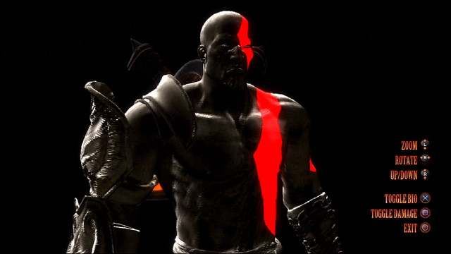
How To Dominate: Kratos On Mortal Kombat
<object classid="clsid:D27CDB6E-AE6D-11cf-96B8-444553540000" width="437" height="265" id="viddler"><param name="movie" value="http://www.viddler.com/simple_on_site/e9c40491" /><param name="allowScriptAccess" value="always" /><param name="allowFullScreen" value="true" /><param name="flashvars" value="fake=1"/><embed src="http://www.viddler.com/simple_on_site/e9c40491" width="437" height="265" type="application/x-shockwave-flash" allowScriptAccess="always" allowFullScreen="true" flashvars="fake=1" name="viddler" ></embed></object>
NetherRealm Studios and Sony Santa Monica Studios collaborated closely to ensure that God of War’s ultra-violent antihero was faithfully recreated for his highly anticipated (and PS3-exclusive) Mortal Kombat debut. Now that the shrink wrap is off the game, my hands-on play sessions have yielded some powerful tactics. First, a few observations:
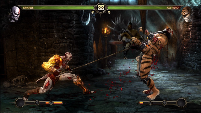
Kratos is a tactician, not a brawler. Kratos’ style combos aren’t particularly fast or powerful, so wading into combat while mashing buttons won’t get you results worthy of the God of War. An effective Kratos player must demonstrate equal parts finesse and animal cunning.
The Helios Head gets results. Like Scorpion’s spear or Sub-Zero’s ice blast, the Helios Head is Kratos’ go-to special attack. You’ll learn to love it for several reasons: the blast boasts impressive range, stuns on impact, and shuts down jumping attackers. More importantly, it can chain a fast, weaker opening combo into a mortal monstrosity, especially when followed with the Olympic Ascension (below).
It helps to rise to the occasion. The key to unlocking Kratos’ highest damage potential is the Olympic Ascension (Back + hold Triangle), a powerful juggle that launches both fighters into the air. Follow up with the Olympic Toss (Circle) for a crushing finale and upwards of 30% damage.
Kratos: turtle killer. Torment a defensive foe by alternating between the Hades Pain (Back + Square, Back + Circle) and the Hades Edge (Back + Square, Triangle). The former ends with a low attack; the latter will defeat a crouching block. Mix them up to keep your opponent off balance in close-quarters brawls.
Don’t get overwhelmed. When confronted with a speedy, teleporting opponent such as Scorpion or Smoke, stay at a distance and blast away with Apollo’s Bow while fending off incoming attacks using the Golden Fleece (Down, Back, Square).
Kratos eats fireballs for breakfast. Just like in the games, the Golden Fleece will even reflect incoming fireballs back at your attacker. Take that, Shang Tsung!
Movelist
Head of Helios: Down, Back, Triangle
Notes: Stuns enemies, easily chained into combos, Enhanced version adds extra damage
Apollo’s Bow: Down, Forward, Triangle
Notes: Fires two projectiles, Enhanced version fires three
Zeus Rage: Down, Forward, X
Notes: Follow the button prompts to complete, Enhanced version adds third hit
Golden Fleece: Down, Back, Square
Notes: Parries incoming attacks, triggers counterattack, redirects projectiles
Hermes Dash: Back, Forward, Circle
Notes: Can be charged up for extra damage, will hit airborne enemies

Fatalities
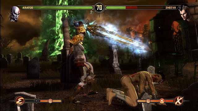
Blade of Olympus: Down, Down, Back, Forward, Triangle (sweep distance)Medusa’s Gaze: Down, Back, Down, Forward, Square (jump distance)
Killer Kratos Combos
Kratos’ most damaging strings tend to open with a basic style combo, transition to the Helios Head, and conclude with an ultra-damaging Olympic Ascension juggle. With a little experimentation and a lot of hands-on time, I crafted the heavy hitting combos below. But this is just the beginning. Be sure to share your favorite Kratos combos (include a sweet name!) in the comments below, and I’ll update the list with the best community picks.
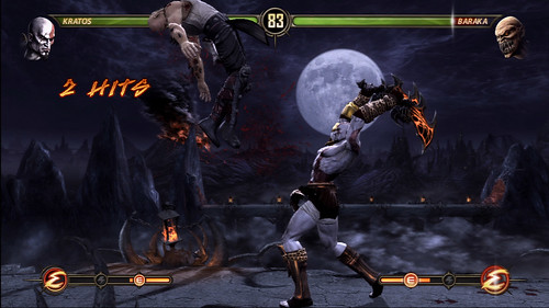
“Hellraiser”
Forward + Triangle, Helios Head, Pandora’s Soul (Forward + Circle, Back + hold Triangle), Olympic Toss (Circle in mid-air)
6 hits, 39% Damage
Forward + Triangle, Helios Head, Pandora’s Soul (Forward + Circle, Back + hold Triangle), Olympic Toss (Circle in mid-air)
6 hits, 39% Damage
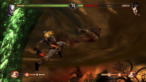
“Zeus Pounce”
Jump kick, Enhanced Zeus Wrath (Down, Forward, X + R2)
5 hits, 23% Damage
Jump kick, Enhanced Zeus Wrath (Down, Forward, X + R2)
5 hits, 23% Damage
“This is Sparta!”
Circle, Helios Head, Enhanced Hermes Dash (Back, Forward, Circle + R2)
3 hits, 23% Damage
Circle, Helios Head, Enhanced Hermes Dash (Back, Forward, Circle + R2)
3 hits, 23% Damage
“Sun and Moon”
Jump punch, Athena’s Fury (Triangle, Square, Triangle), Apollo’s Bow
6 hits, 20% Damage
Jump punch, Athena’s Fury (Triangle, Square, Triangle), Apollo’s Bow
6 hits, 20% Damage
Destroy Shao Kahn in the Ladder mode with Kratos and you’ll earn the Blades of Exile item. Cash it in at the Nekropolis to unlock Kratos’ alternate “Fear” costume — the same outfit you earn by completing God of War III.
Subscribe to:
Posts (Atom)